Responsibilities
- Competitor research
- Iterate on the initial concept
- Design and prototype key user flows
- Elaborate, visualise and test new user flows
Role
I led the UX/UI design of this project from initial raw concept to handoff to developers. I collaborated with the project manager throughout the entire project.
Timeline
06/2022 — 10/2022
Context
About
Founders of Bildly platform aimed to revolutionise the construction industry and elevate construction projects management to a whole new level.
Challenge
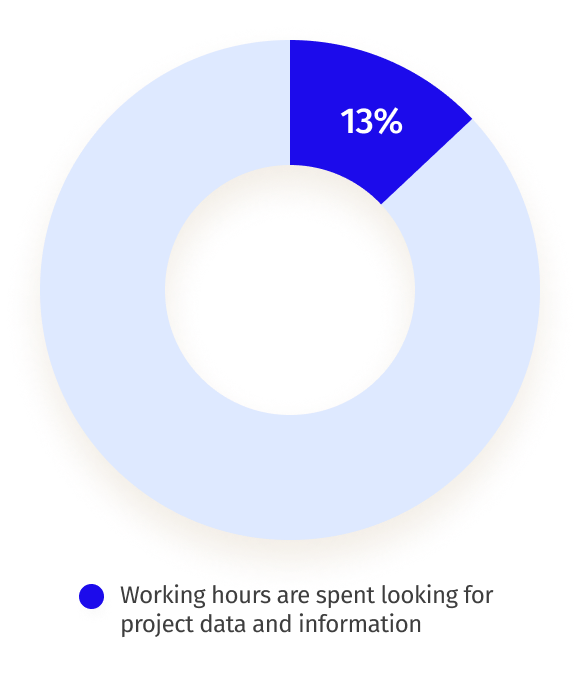
Engineering and construction companies face problems with project management, effective communication and incorrect project documentation. Studies show that around 13% of working hours are spent looking for project data and information.
Impact
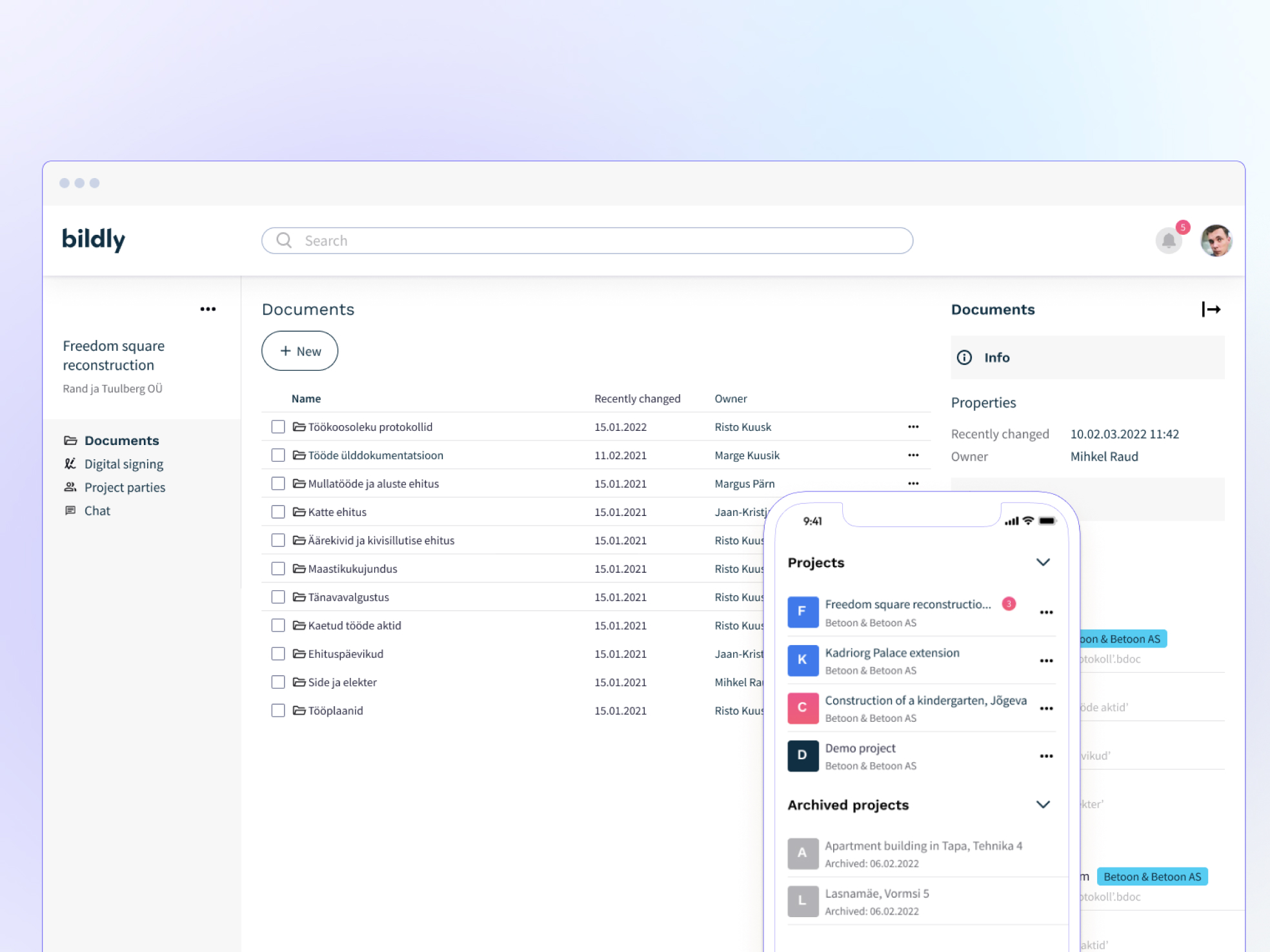
I redesigned few initial screens of the concept and crated mobile and desktop MVP prototypes ready to be handed off to developers.
Before and after
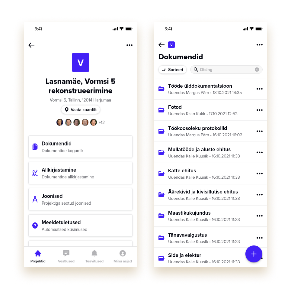
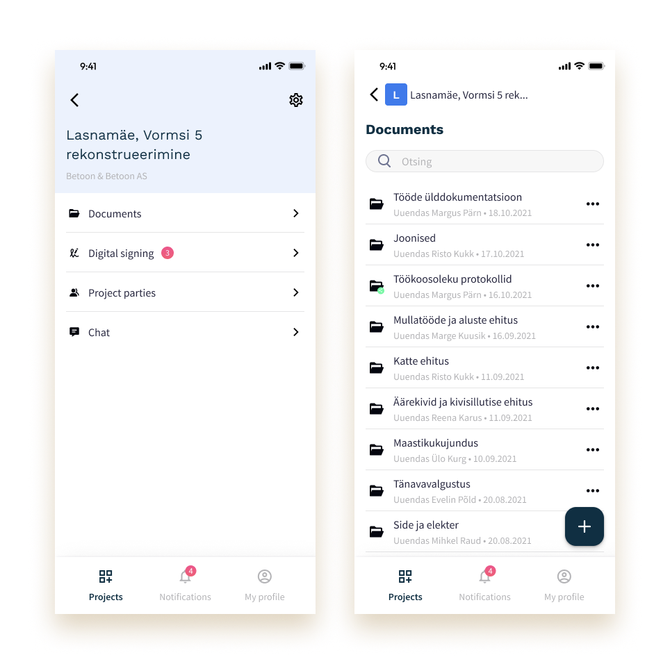
Where I started
Desk research
This helped me to gain a sense of the industry, better understand limitations and problems target audience faces.
Key insights
Incorrect information is construction’s biggest problem because commonly construction project information and changes are stored on an individual’s desktop or mobile devices.
According to FMI report (fmicorp.com, 2018) 96% of all data captured goes unused in the engineering and construction industry, 90% of data generated is unstructured, and 13% of Engineering & Construction working hours are spent looking for project data and information.
Identified pain points
- Construction companies still managing info via Excel and on paper;
- Different applications are used for different tasks;
- Information is spread, but not synchronised;
- Problems with project management.
Design process
Competitive analysis
I analysed and evaluated the features and flows of digital solutions used in the construction industry.
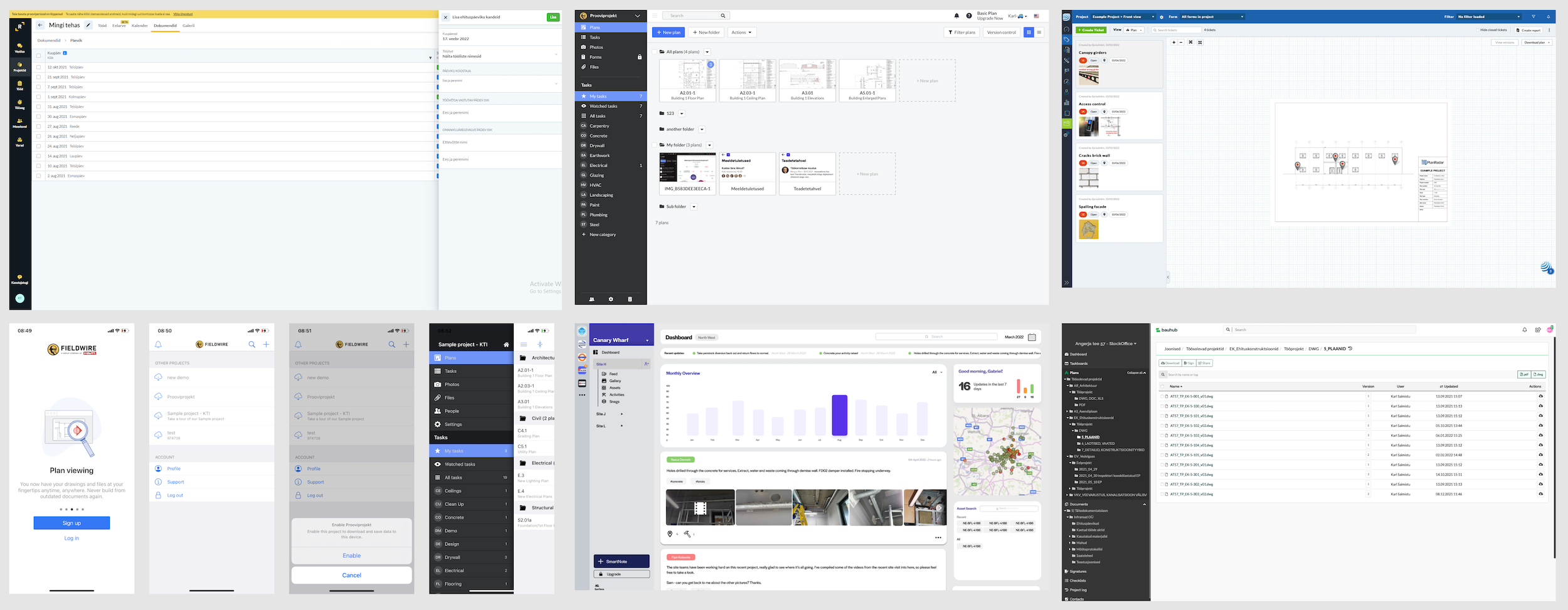
This analysis helped me to identify potential opportunities.
Design solution
To focus on the main problem in the construction process — lack of correct information and inconsistent communication.
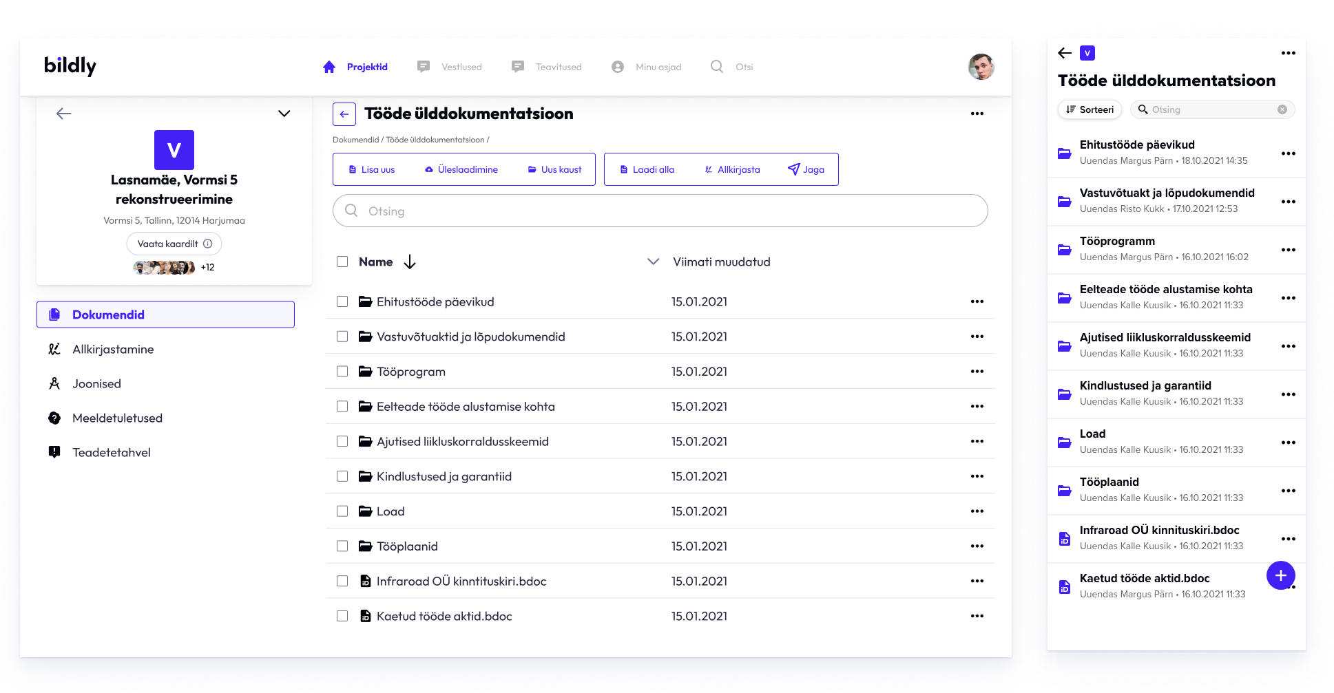
Defined target audience:
- Construction companies, who would like to organise and keep up-to-date project documentation, monitor project progress and bring the whole project team together under one roof.
- Subcontractors and property owners, who need to access project documents and collaborate with project managers and other teams.
After several iterations on the prototype, tests and interviews with stakeholders, it was decided to reduce the functionality of the application to key features:
- Document Management
- Digital signing
- Communication with involved parties
- Chat
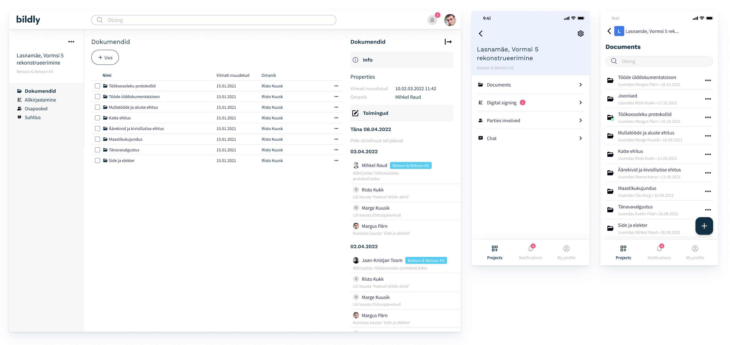
The main user flows
- Home screen and projects;
- Communication with involved parties;
- Chat
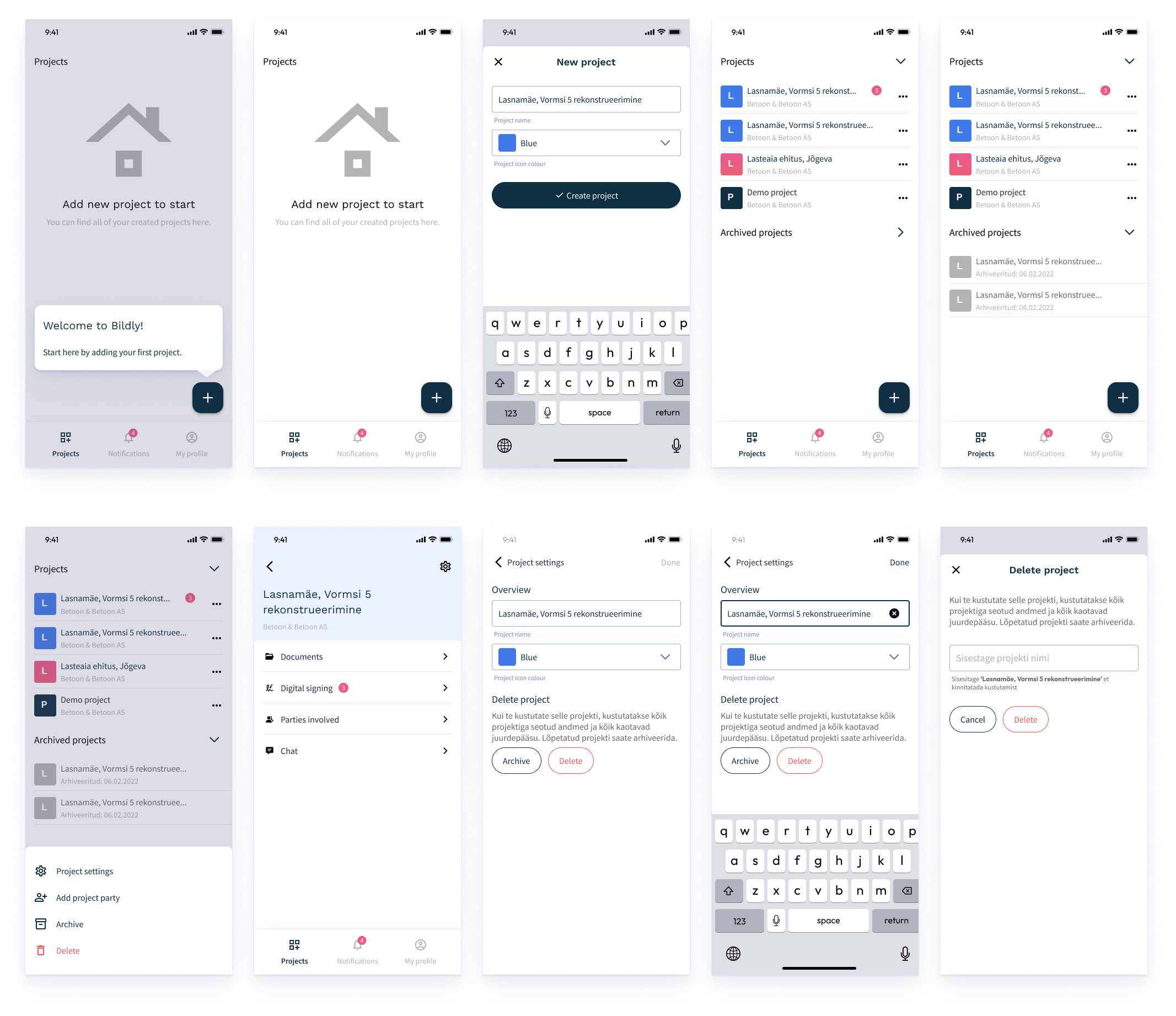
Home screen and projects user flow
- Ability to see all projects that are assigned to a user or created by the user;
- Possibility to create new projects and add participants from the team or outside of the team.
Communication with involved parties user flow
- Add a new party;
- Teammates and external parties profiles.

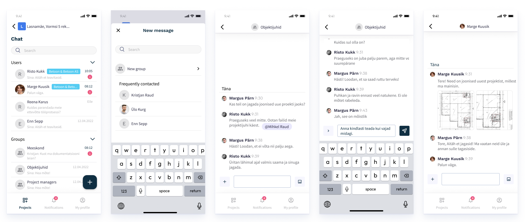
Chat user flow
- DM’s and groups;
- Possibility to generate groups.
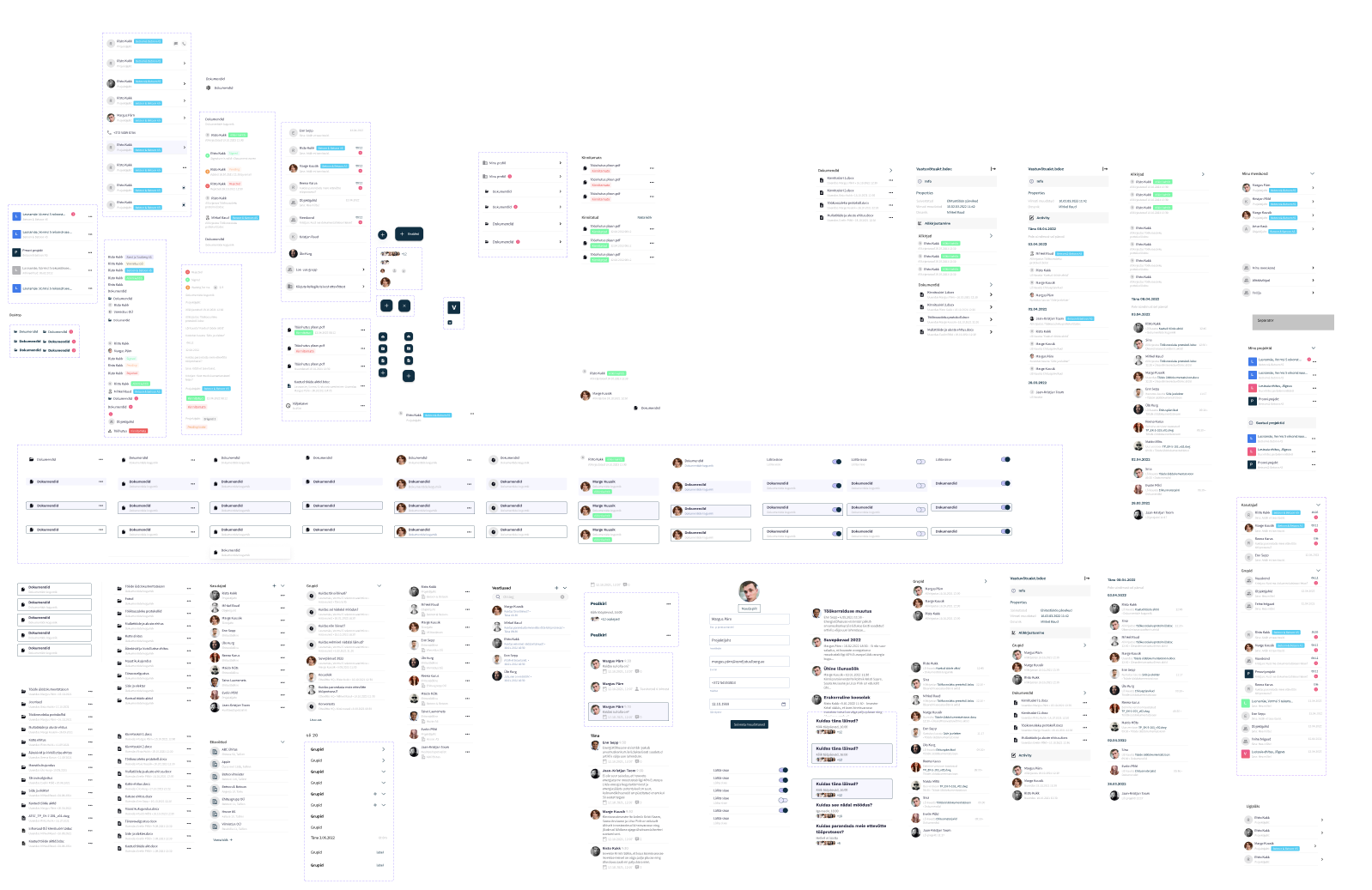
Components set
Components were used in order to speed up workflow and maintain consistency.
Prototype
The mobile version of the created prototype
Reflections
The main goal to create desktop and mobile prototypes of MVP solution was accomplished through several iterations and pivots on the initial concept.
What I learned
- While working on this project in Figma I was able to improve my prototyping skills;
- I learned how to organise large projects and maintain a large set of components.
