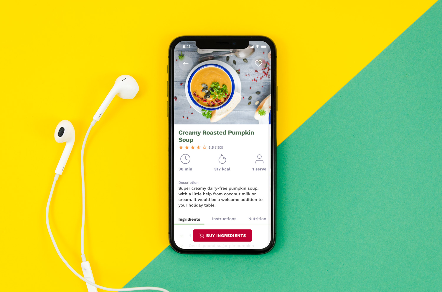
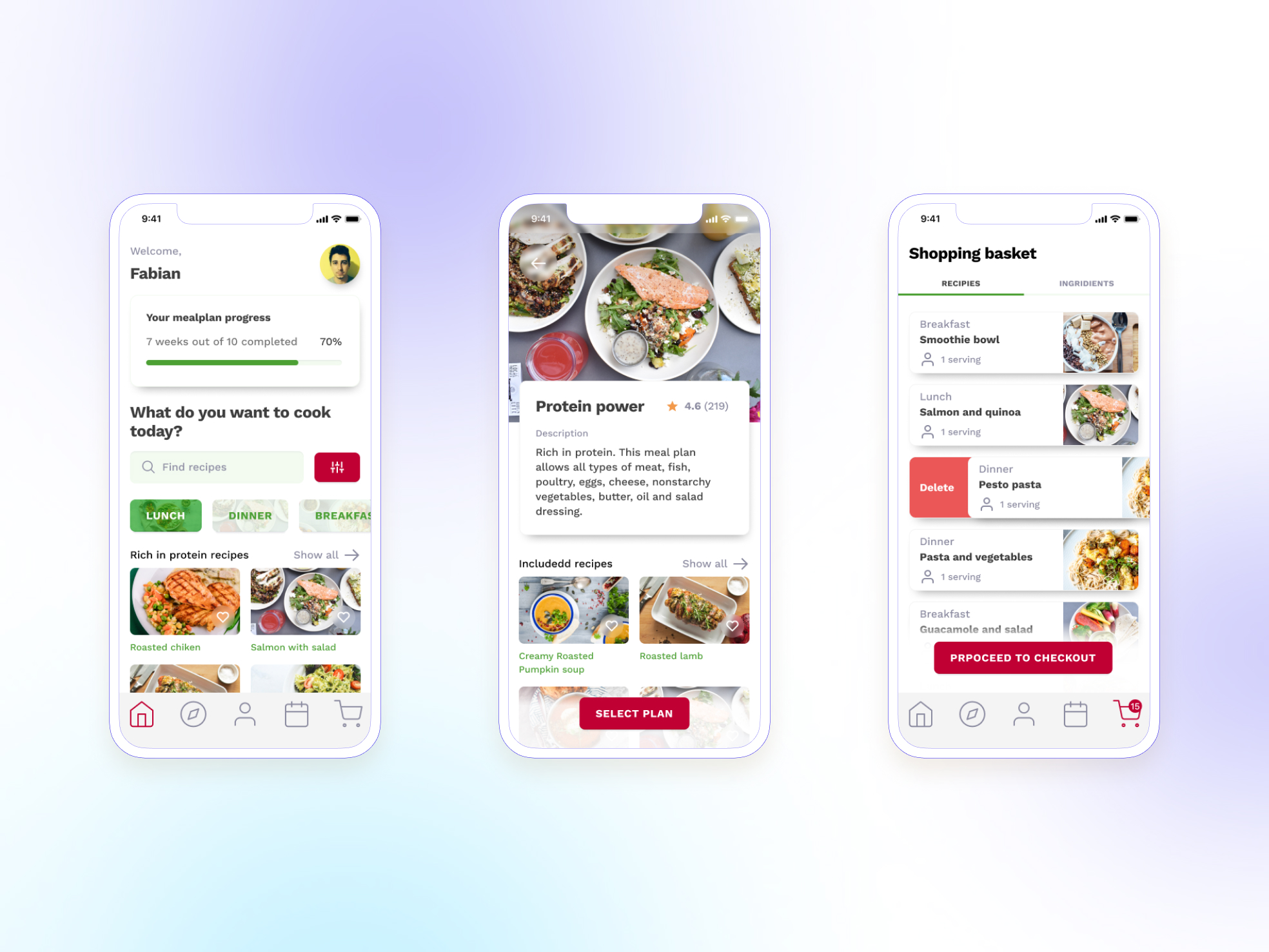
This is a student project based on the case presented to us by customer experience agency Creuna. This project took place over a 4-week duration. Stakeholders were our teachers and Creuna designers.
The design problem
Initial concept description
Arla Click & Cook platform allows users to browse through recipes database, buy necessary ingredients online and get them delivered home.
Current target audience: dual-career families, who plan their meals in advance, and order delivery to their office. Ingredients will be delivered by the end of the week, so families will prepare meals for weekend and following days.
Tasks
- Primary: How we can expand initial concept and make it appealing to other market segments?
- Secondary: How we can improve overall experience of existing solution?
Challenges
- Persuasive Design. To change attitudes and behaviours of the users
- Digital nudging. To steer users to targeted behaviours and decisions
My roles and responsibilities
- Conduct desk research and user interview;
- Create wireframes and prototype in Figma;
- Collaborate with 3 other member of the team and stakeholders.
While working on my portfolio I redesigned all the screens which were created initially and added a design system.
What I learned
- While working on the design in Figma I was able to improve my UI design skills;
- Creating the design system for this project helped me to understand the value they bring to design process. I learned how to develop, use and maintain them.
Used UX methods
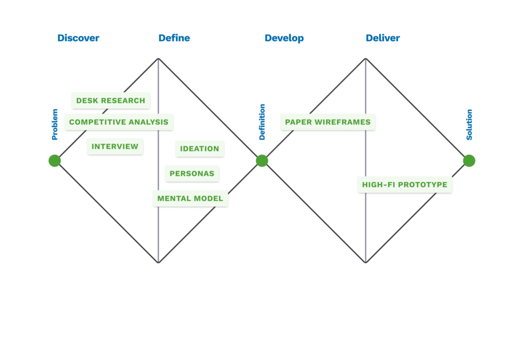
The Double Diamond framework guided us throughout the design process, from the problems to the solutions. Different methods and tools used in each phase of the process helped us weed out assumptions and create value.
Prototype
Prototype for this project was created in Figma.
Where we started
Desk research
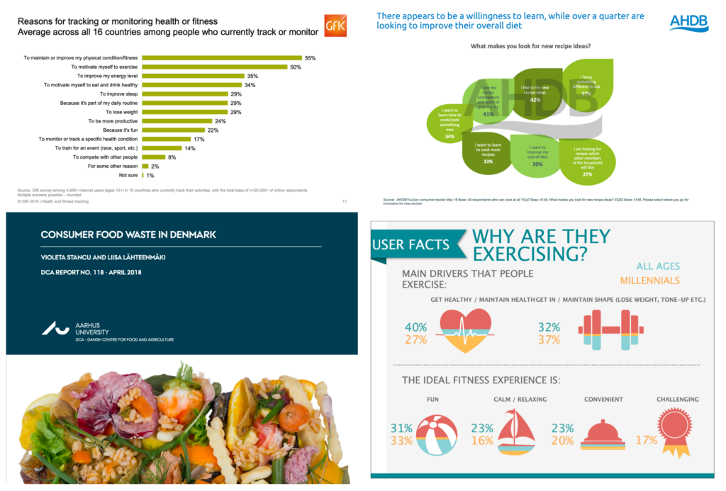
The main goal of desk research was to define the new target audience for this concept. Based on the insights gathered through desk research, our team decided to appeal to the audience who engage in physical activities and fitness.
Key insights
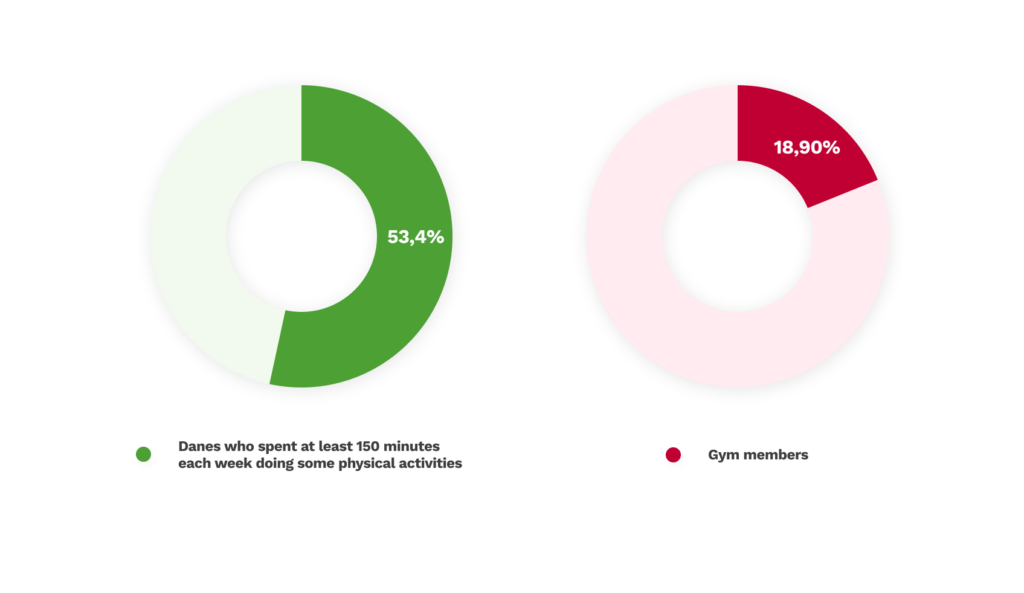
“Some 53,4 percent of Danes aged over 18 spend at least 150 minutes each week doing some physical activities in their leisure time, including cycling as a form of transportation.” (The Copenhagen Post, 2017)
Denmark is in the top 5 countries with the highest fitness club penetration. 18,90% of the population of Denmark are gym members. 572 000 members is the membership base of Danish market leader Fitness World. (Fitness World, Annual report, 2018)
Motivation behind eating patterns
According to Food and Health Survey (FoodInsight.org, 2018) almost half of consumers point out they adopted a new eating pattern in an effort to lose weight. Five top reasons for adopting a new eating pattern:
- I wanted to lose weight;
- I wanted to feel better and have more energy;
- I wanted to protect my long-term health/prevent future health conditions;
- I wanted to prevent weight gain;
- I wanted to improve my health so I can have more independence in life.
Cooking confidence is the key
According to AHDB/YouGov survey (AHDB Retail and Consumer Insight Snapshot, 2018) 7 in 10 consumers enjoy cooking and 47% say they would cook more if they knew more simple dishes using a few key ingredients. Cooking confidence is a key factor in choice of meal to cook and for those, who are less confident, it can be a barrier to wanting to cook.
Recipe boxes is the new emerging niche as consumers look for meal variety, health, enjoyment and convenience when they are cooking and eating. Trade off in favour of recipe boxes is that menu planning and inspiration have been outsourced and waste is eliminated or reduced.
Less likely to make impulse purchases
Consumers who purchase groceries online are more likely to stick to their choices versus purchasing in the supermarket and exposing themselves to dilemmas that might interfere with their choices.
The daily grocery shopping is exhausting consumers cognitive capacity. “According to Wansink (2015), consumers estimate to make 20-30 decisions connected to a typical daily food shopping, but in reality they sum up to almost 200.” (Can we nudge ourselves?, Gabriele Torma, 2018)
Understanding process
We signed up with the platform and purchased ingredients for one of the recipes to become familiar with the concept and understand the existing user workflow.

User research
We conducted interviews with casual fitness enthusiasts to learn more about their shopping behaviour, eating habits and sport activity. My team assumed that people who actively do sports pay more attention to their diet. One of the main goals of our interviews was to validate this assumption.
We found out that people who exercise are conscious about the food they eat, as we previously expected. We also understood that many people pay attention to macronutrients and their proportions. Not everyone is using meal plans, but those who do are not always strict with that.
“I definitely pay attention to diet. It is probably even more important than working out. I am focusing on getting enough macros in, that’s a priority. I’m also trying to get enough veggies and potassium, but I’m less consistent with it. The most important thing for me is protein. After depending on the food, I’m also trying to buy stuff where there are not that many E numbers. I don’t use meal plans. It is more like keeping the macros and being spontaneous during the day.” (User Interviews)
“I try to eat a balanced diet or balanced meals where I have enough carb, proteins, fat and vitamins. I also consider food in the amount that you would not gain unhealthy weight unless it is part of your training goals. I follow a specific food plan. I don’t stick 100% to it, but try to keep it in my mind. I follow basic macronutrient rules, with proportions of carbs, protein and fat, and a certain amount of calories. Within those limits, I try to eat what I can.” (User Interviews)
Design Process
Competitive analysis
We evaluated features and flows of popular digital solutions appealing to health and fitness-conscious audience. We also looked at offers by subscription recipe box suppliers, as they are direct competitors of the existing concept. Three popular mobile apps targeting audience with same preferences were reviewed.
This analysis helped us to become familiar with the landscape and dive deeper into the niche. It also helped to onboard ourselves with experiences our target audience face and understand their behaviour.

User Persona
Extreme users
Identifying the amplified needs of extreme users helped us pull out more meaningful insights and see a deeper holistic perspective of the context.
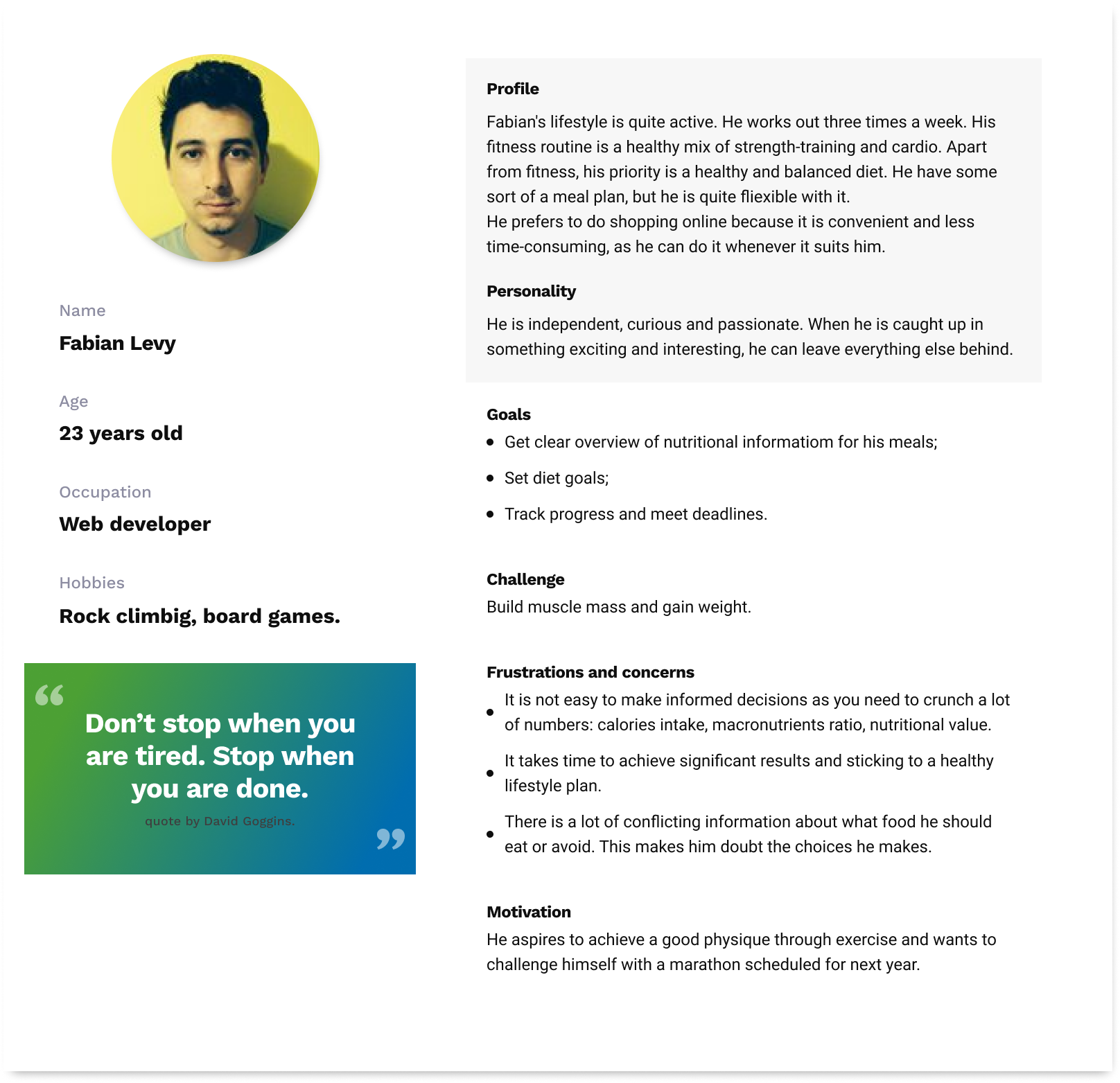
Our primary user Fabian does training three times a week and spends approximately six hours cooking per week. He is following a meal plan which he is creating a week in advance. He has three main goals:
- Get a clear overview of nutritional information for his meals;
- Set diet goals;
- Track progress and meet deadlines.
Our secondary user Toby is on the opposite side of the spectrum. He does not have any meal plans. His diet is slightly unhealthy, and he eats fast food or takeaway sometimes. He goes to the gym irregularly when he is in the mood. He wants to include more healthy options into his diet, but he does not know where to start. Toby’s goals:
- Get inspiration and ideas for healthy meals;
- Find recipes that are suitable for his cooking skills.
Mental model
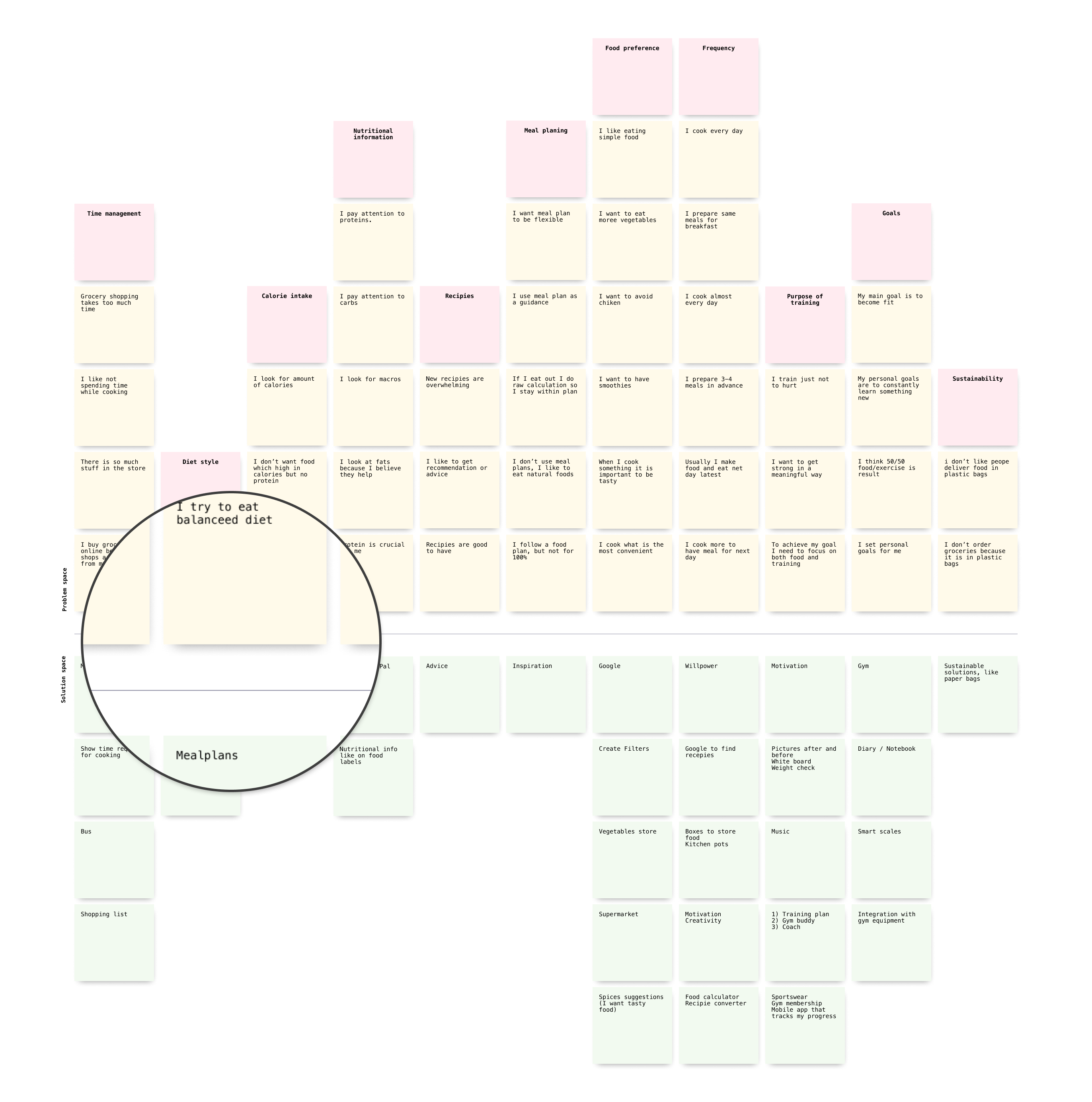
Mental model diagram is an explanation of how someone thinks of how something works in the real world. Using mental model diagram helped us to align the product features with actual user needs and underlying behaviour.
Design solution
- Pivot toward fitness enthusiasts who do sports and watch their diet more closely.
- Provide users with predefined sets of recipes — meal plans tailored for different user goals and segments.
- Allow users to build customisable meal plans based on their food preferences and tastes.
Value for the user
- Engagement and personalisation;
- Time saved for meal planning;
- Reduce of cognitive load.
Value for business
- Tap into the new and profitable market segment;
- Implement habit-building and increase amount of returning users;
- Improve brand image.
As is & To be user flows

Mealplans
Example cards with meal plans
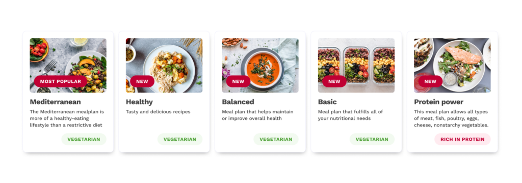
Based on the information provided by users, during the onboarding process they will be presented with the recommended plan most suitable for their goal and diet type. Providing users with smart defaults is a form of priming. It works best when user’s motivation is taken into account, and they are presented with sufficient evidence that recommended option provides value for them.
To steer users to targeted behaviours and decisions
Encouraging users customise plans is resulting in feeling ownership, as we are more attached to things for which we feel involvement. Having the opportunity to influence or contribute to the choices makes them more personal and valuable.
Onboarding process
Information about the user’s diet goal, diet type and possible allergies is collected during the onboarding process.

Digital nudging and personalisation
Information collected during onboarding helps to personalise content and provide recommendations. Instead of generic meal plan “one size fits all” platform will provide different meal plans tailored for different user goals and user segments. Most suitable plan will be highlighted as recommended.
Predefined meal plans user flow
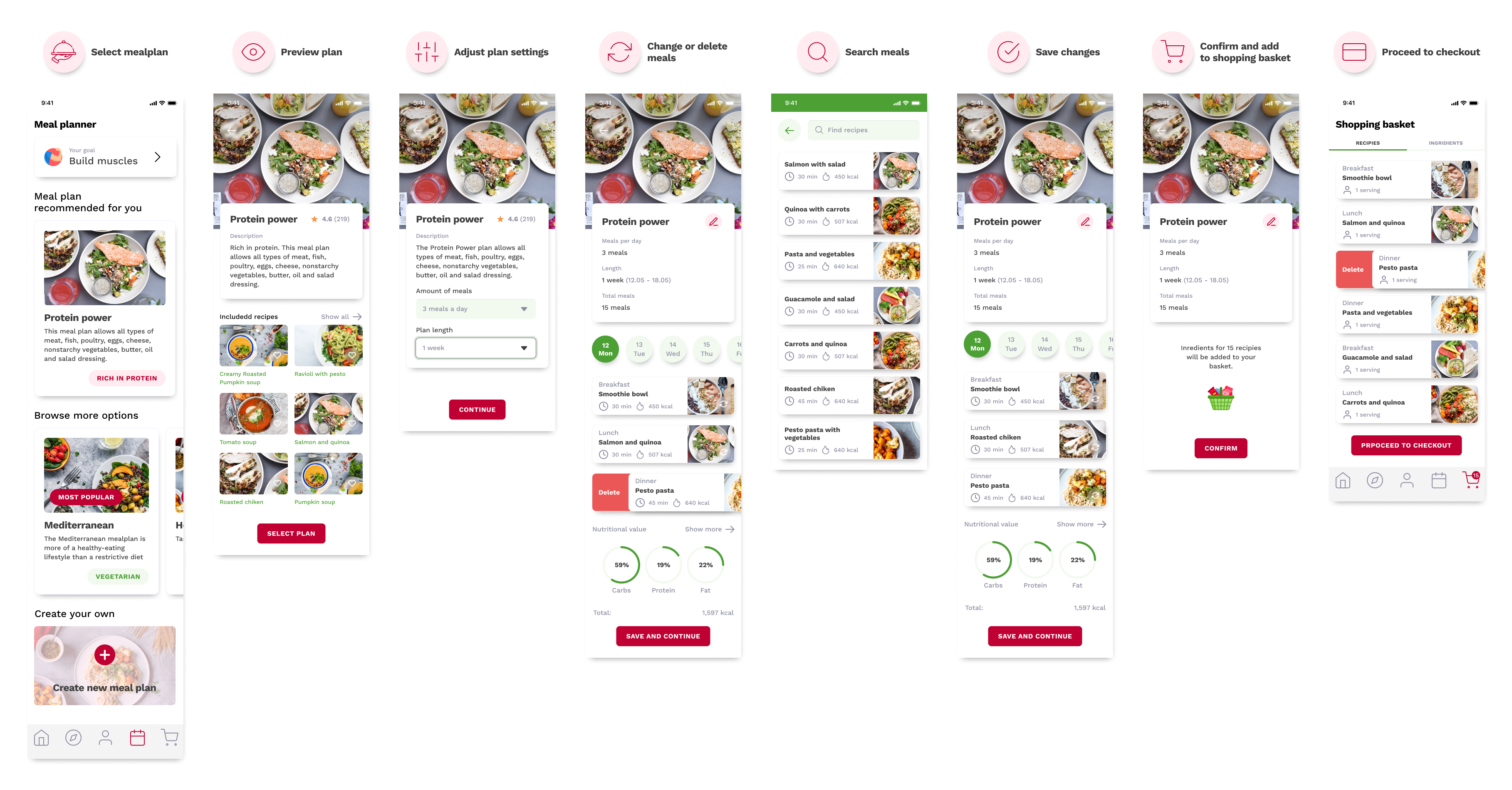
Alternatively users can create their personal meal plans. They don’t need to crunch loads of numbers in order to make sure that the plan they follow is perfectly balanced according to their diet and preferences.
Customised meal plans user flow
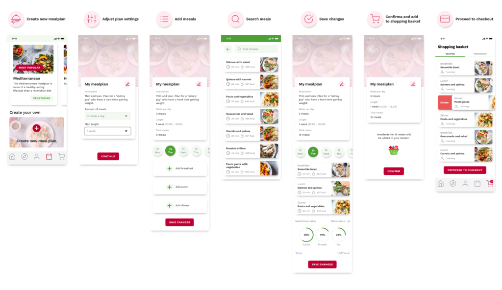
Behavioural approach
Habit-building
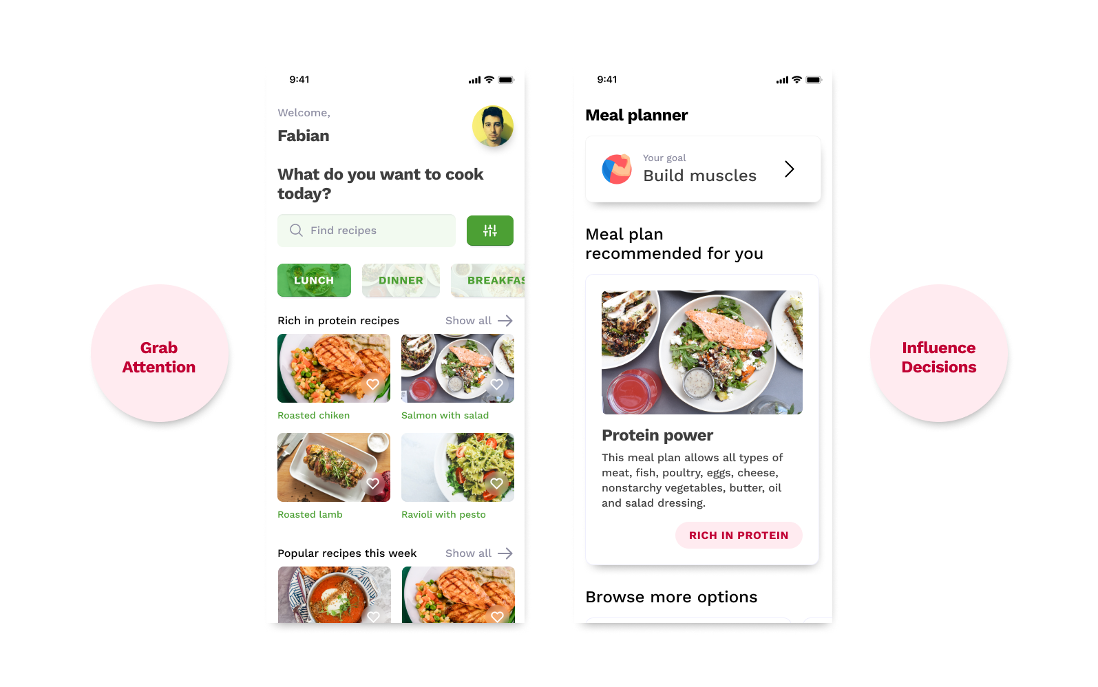
Applying Four-stage framework Grab attention, Influence decisions, Facilitate action, Sustain Behaviour helped us to embody behavioural thinking into this project.
- Grab attention. Users are provided with personalised content on the Home and Meal planner screens. It helps to draw user’s attention as people respond strongly to messaging relevant to their interests.
- Influence decisions. Users value suggestions and more compelled to act when provided with clear next steps.
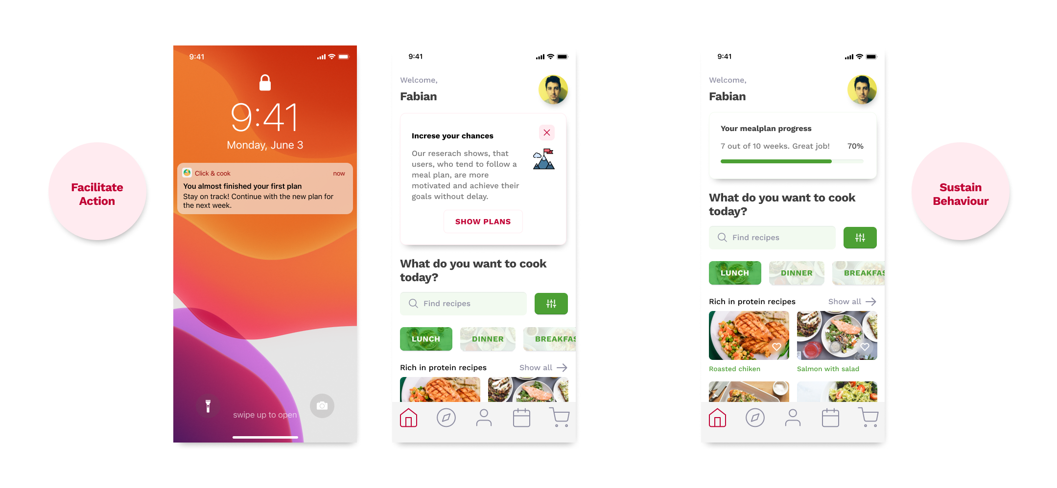
- Facilitate action. User is most likely to follow his plan, if he is motivated to achieve his goal, is able to do it and reminded by a trigger. When users are getting closer to the end of their existing plan, they will receive a notification inviting to create a new plan for the next week.
- Sustain behaviour. Positive feedback is a way to celebrate user progress. Card on the Home screen indicating of how much is left to achieve their goal.
Coherent approach
Detailed nutritional information
In the recipe cards nutritional information of meals as well as macronutrients ratio is presented in a user friendly way.
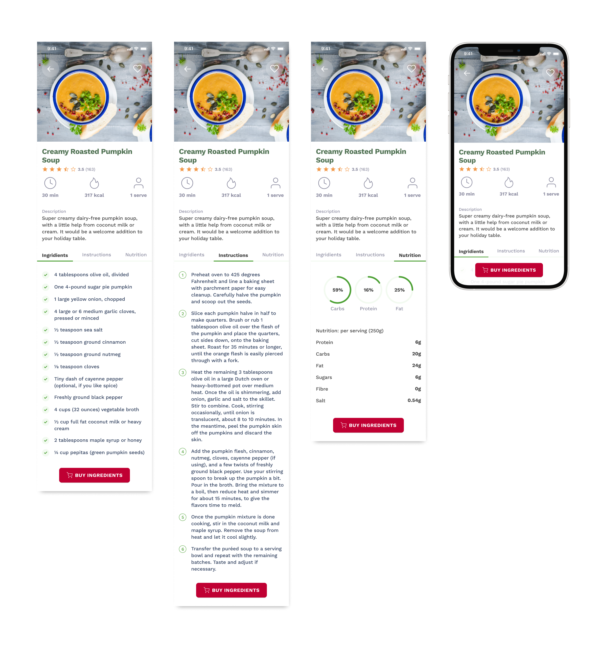
Nutritional information of the meals before and after

Design system
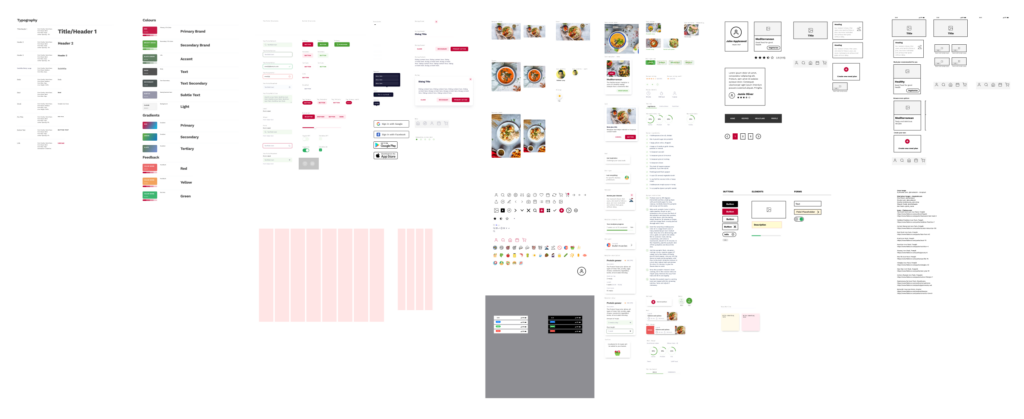
Created design system helped to form the identity of the solution, maintain consistency and speed up design process. Design system of this project includes:
- Type scale;
- Colour scheme;
- Grids;
- Form and dialog elements;
- Media and cards;
- Icons.
Results
The main goal to expand the concept to a new market segment and make it appealing was accomplished by following the design process outlined by the Double Diamond framework. Experience of existing solution was improved by applying digital nudging and behavioural approach. Concept was very well received by stakeholders and our teachers.
However, there is important part of design process which is missing. Our team wasn’t able to dedicate enough time for usability testing and validating the created solution with target audience. It is necessary to test the solution with at least 5 users from both user segments in order to make sure it meets user’s need and expectations. Once the usability tests are done and feedback from users is collected, it will be possible to decide whether to move forward with suggested concept or pivot.
