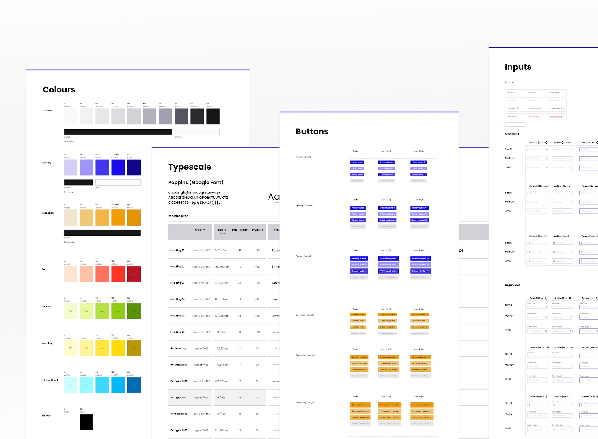
I’m excited to share the UI kit I recently crafted in Figma. This is my personal project where I applied my knowledge of setting up styles, components and documenting UI design.
What is a UI kit?
A well-crafted UI kit consists of reusable UI components, including buttons, inputs, navigations, along with font and typography styles, color palettes, and various other valuable design assets and elements.
Difference between a UI kit and a design system kit
A comprehensive UI kit consists of ready-to-use components, layouts, and templates for quick design implementation, serving as a toolkit to accelerate the design workflow. In contrast, a design system kit provides design guidelines, explaining how they can be used in different scenarios. While a UI kit focuses on UI elements, a design system kit provides a broader framework for cohesive and unified design practices.
Why use one?
Using UI kits can significantly speed up the design process and streamline workflow. Creating UI kits from scratch for every project can be time-consuming even for experienced designers. By eliminating the need to recreate common elements from scratch, you can focus more on the unique and intricate aspects of each project.
Using pre-designed UI elements not only frees up valuable time for problem-solving but also ensures consistency across the project.
This free Starter UI kit I came up with includes basic styles and components:
- Colours;
- Typography;
- Grids;
- Icons;
- Shadows;
- Buttons;
- Inputs;
- Checkboxes and radio buttons.
I crafted this starter kit with care, ready for everyone to kick off their projects. It is well-designed and creates a smooth starting point for any project.
I’m convinced. What’s next?
This Starter kit is available in Figma format on my profile page in Figma community. Feel free to integrate it into your next design project and elevate your digital creations to new heights!
